To build your custom version of Crescendo, certain assets are required. Collecting these assets is typically a collaborative process between your team and the Crescendo team, often involving a few iterations to get everything just right.
Some assets are required, while others are optional. Examples of these assets, along with recommended dimensions, are listed below. You can also provide separate versions for small screens, such as iPhones, and large screens, such as iPads, if needed for your design.
1. App Name
Although not an asset, the app name is a made of one or two words and is required to begin the white labeling process.
We ensure that the App Name is not too long for the iPhone/iPad home screen. We also check that the name is unique to the Apple App Store.
2. App Icon [2048 x 2048]
The app icon is a square image (2048 × 2048 px) used on the home screen and submitted to the App Store as the official icon.
- Do not round the corners of the image; iOS applies corner rounding automatically.
- Avoid excessive details; icons are small and need to be recognizable at a glance. Focus on a single, clear shape or symbol that represents your app.
- Leave some padding so the icon doesn’t feel cramped or get clipped. Avoid important elements near corners
- Avoid overly complex effects. Shadows, 3D effects, or excessive highlights can make the icon messy when scaled down
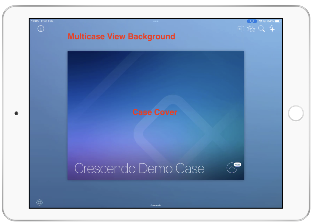
3. Background(s) [3072 x 3072]
This asset(s) is used in four different locations of Crescendo:
- Login Screen
- Multicase View background
- Default Case background
- Default Case cover (if none is specified)
The login screen and multicase view often share the same background. The Default Case Cover and Multicase View background are usually different to avoid an awkward overlap.
We recommend avoiding busy or distracting images. Users should focus on folder icons and documents, not the background.
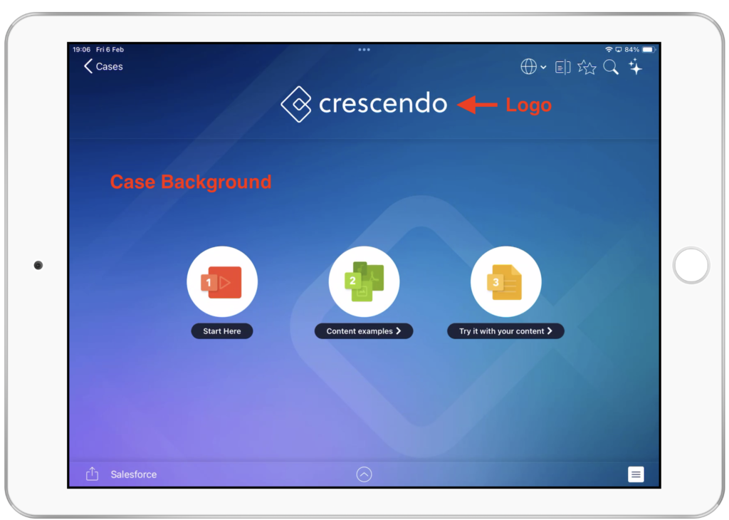
4. Default Logo [~650 x ~250]
When a brand new case is created and there is no theming applied to it, the default logo is used as a placeholder logo for the Case.
A typical logo is a rectangle up to 650 pixels wide and 300 pixels high, though the exact proportions depend on the shape of your company logo.
5. Default Folder icon [200 x 200]
Where no theming is applied on a folder inside a case, the default folder icon design is applied.
6. Login platforms
Let us know if you’d like to remove login options that aren’t relevant to your company. For example, if your users should log in only with SharePoint, keeping other options may cause confusion.
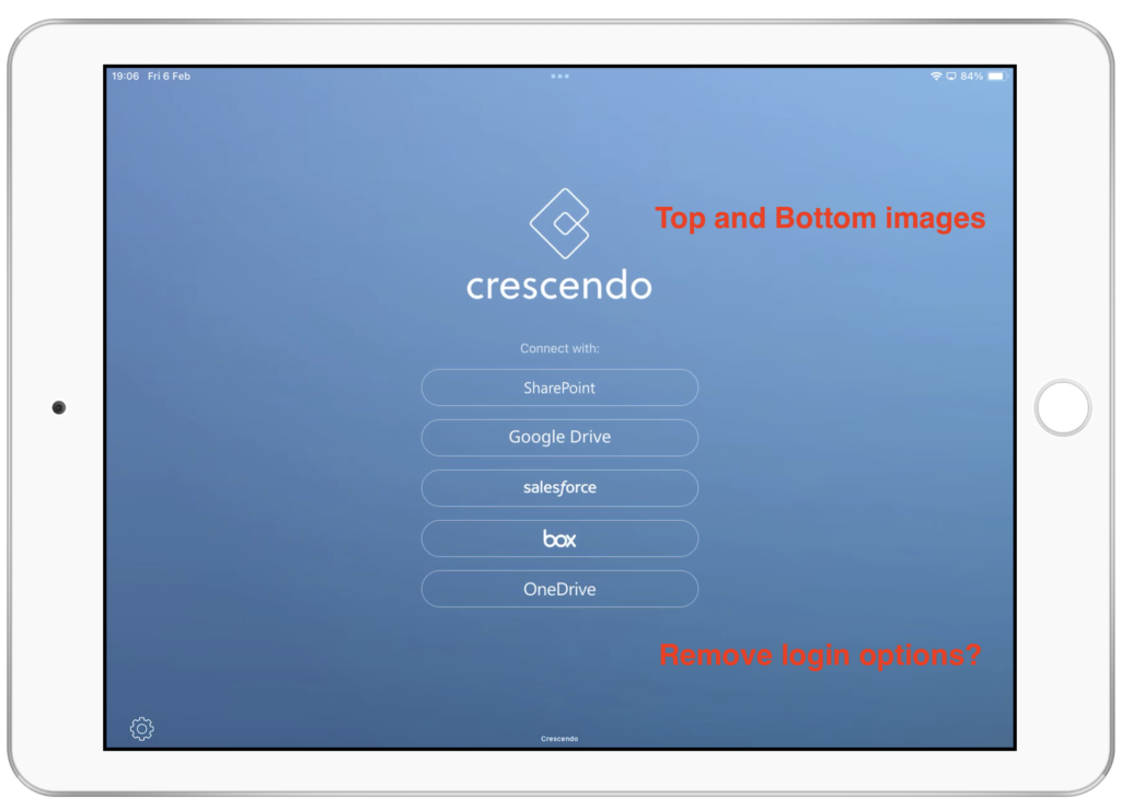
7. Login screen Bottom image [any size]
An image can be anchored to the center of the Login Screen above the cloud storage source to connect with. This image has been used to display a message to users or implement further designs to the login screen.
8. Login screen Top image [any size within 400 x 400]
This is typically the same image as the app icon logo. It is placed above the Login screen Bottom image.


